Beyond the Flush: Analyzing Sensor Data to Understand Gut Health Patterns
Introduction: The Gut Feeling We Can't Ignore
Gut health. It's fundamental to our overall well-being, yet often feels like a black box. For millions suffering from chronic gut conditions like IBS, IBD, or diverticulitis, understanding personal triggers and predicting flare-ups can feel like guesswork, leading to anxiety and reactive management. What if we could get objective, personalized insights into our gut function, passively, every single day?
That's the vision behind IntelliGut. We're developing a smart toilet seat equipped with advanced sensors to analyze the chemical environment during each bowel movement, providing a unique window into gut activity. Recently, we undertook an intensive analysis of data collected from one of our prototype seats over several weeks, specifically focusing on a period that included dietary changes and a significant health event for the user (myself, Ken!). We wanted to see: can these sensors truly detect meaningful changes?
The Experiment: Tracking Gut Signals Through Life's Ups and Downs
Over roughly a month (late Feb to late Mar 2025), our prototype collected data on various gases (like methane, hydrogen sulfide proxies, VOCs, CO2, ammonia proxies), alongside environmental factors. Simultaneously, I logged my bowel movements using our companion app prototype and integrated daily physiological data (HRV, sleep - though sleep/exercise analysis is pending) from my Fitbit via a database.
The key period involved:
A Baseline: Establishing my "normal" gut signature (Mar 7-14).
A Lifestyle Shift: A period away involving significant dietary changes and alcohol consumption (approx. Mar 15-19 - no toilet data collected).
A Pre-Symptom Phase: Returning home to a normal routine (Mar 20-25).
A Symptomatic Phase: Experiencing a suspected diverticulitis flare-up with noticeable symptoms (Mar 26-29).
Our analysis involved sophisticated signal processing to define the start and end of each event, extracting dozens of features (like peak gas levels, total gas produced (AUC), recovery speed), and comparing these features across the different periods.
Key Findings: Listening to the Data
The results were compelling and demonstrated the sensors' sensitivity:
Detecting Lifestyle Impact: The shift after returning home around March 20th was immediate and dramatic across many sensors. Compared to the baseline, we saw a significant decrease in the total amount (AUC) and peak levels of most measured gases (VOCs, H2S proxies, H2, etc.) and a corresponding increase in gas resistance. This strongly suggests the sensors clearly picked up the impact of the preceding dietary changes.
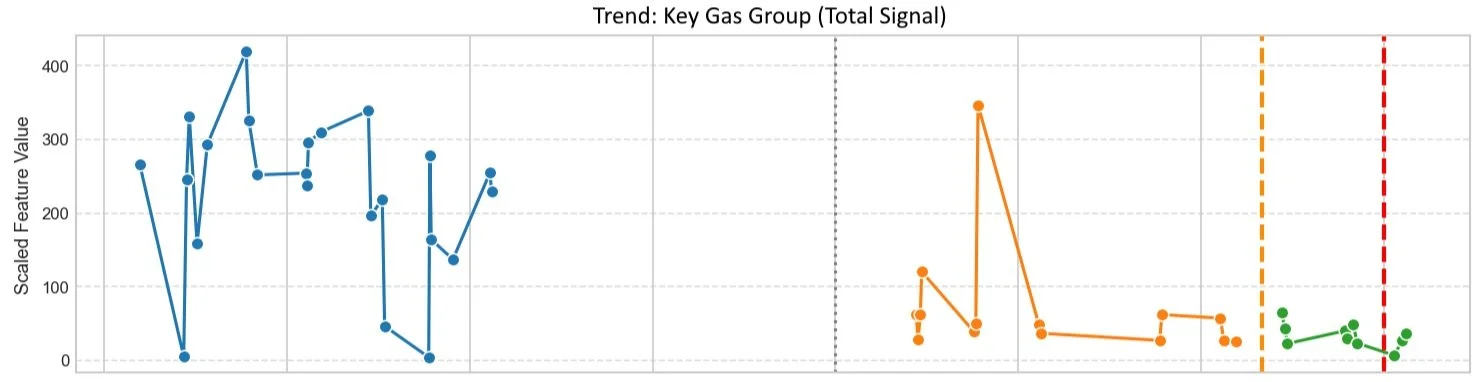
Time series showing a significant drop in Reducing Gas signal (AUC) immediately following a period of dietary change (after Mar 19), persisting afterwards.
Correlating with Symptoms: Specific changes aligned remarkably well with the onset and peak of my symptoms (Mar 26-28):
Peak Methane: While total methane (AUC) seemed to drop slightly post-trip, the peak methane level showed a sharp, distinct fall precisely coinciding with symptom onset on Mar 26th, bottoming out when symptoms were worst.
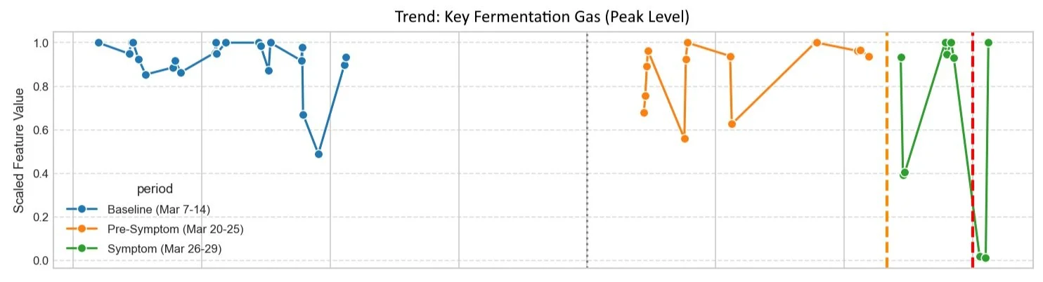
Peak Methane levels remained high post-trip but dropped significantly concurrent with symptom onset (orange line) and peak (red line).
Gas Resistance: This indicator reached its absolute highest levels during the symptomatic period, suggesting the lowest overall presence of typical fermentative gases.
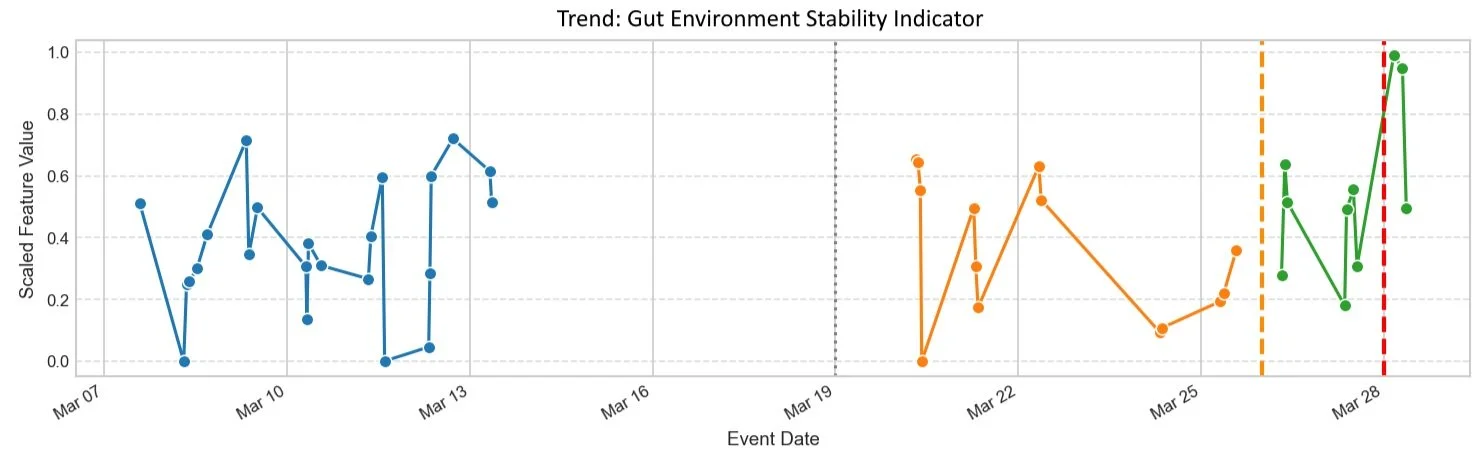
This indicator reached its absolute highest levels during the symptomatic period
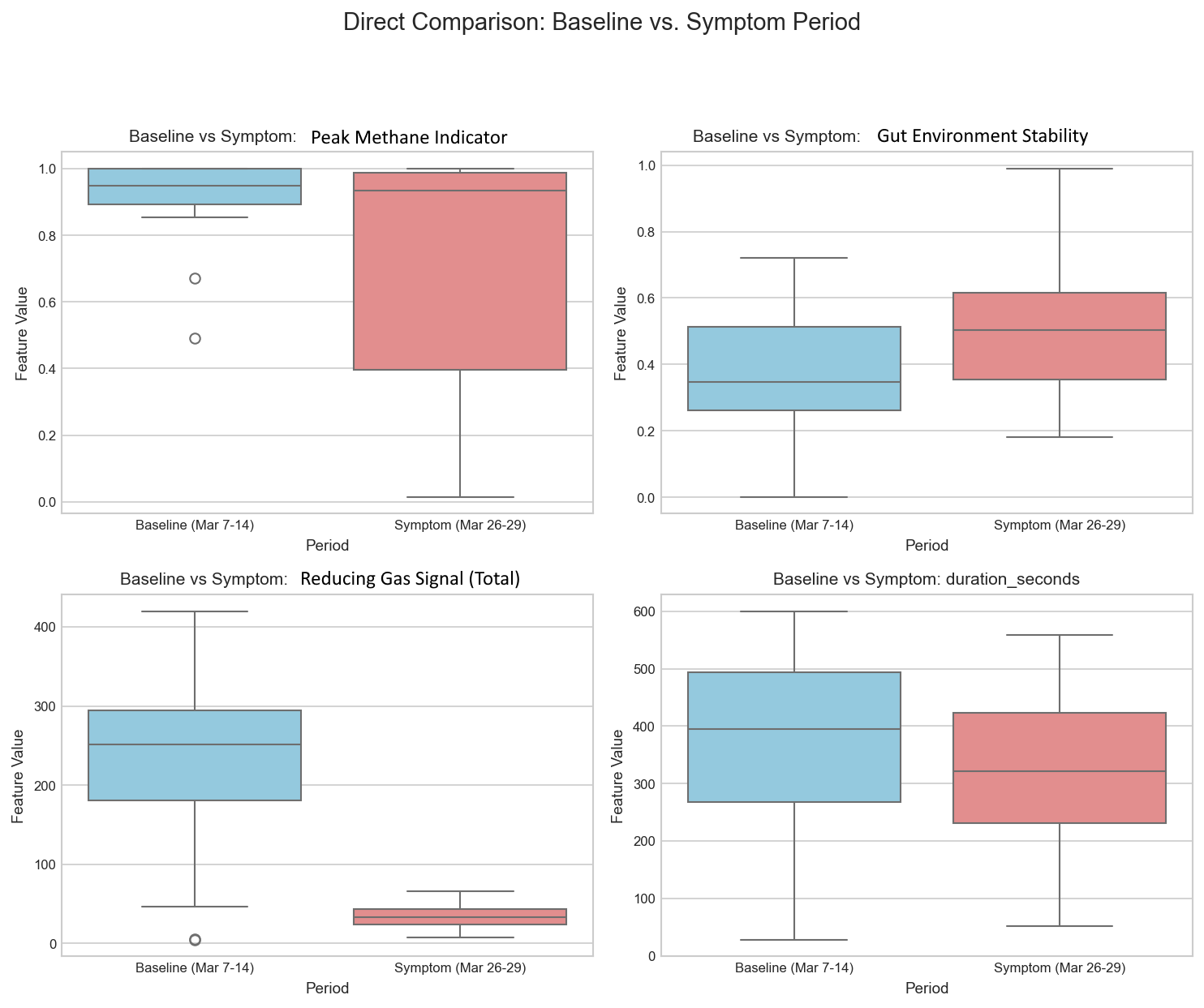
Beyond tracking trends over time, we also directly compared the user's gut signature during the 'normal' baseline period versus the period when symptoms were present. The box plots below provide a clear snapshot of these differences for key indicators. We can see distinct shifts: for example, the median 'Peak Methane Indicator' was noticeably lower during the symptomatic period compared to the baseline. Conversely, the 'Gut Environment Stability' indicator (related to gas resistance) was significantly higher when symptoms were present. Furthermore, the 'Reducing Gas Signal (Total)' showed much lower levels during the symptomatic period compared to baseline, while event duration showed less difference between the two states. This direct comparison powerfully illustrates the system's ability to differentiate between distinct physiological states using passively collected sensor data.
A Potential Early Clue? The Gas Resistance Trend: Perhaps the most exciting finding came from integrating the wearable data. While most gas levels shifted abruptly post-trip, the gas resistance showed a more nuanced pattern. After an initial jump post-trip, its rolling average continued to trend gradually upwards during the pre-symptom week (Mar 20-25). Simultaneously, my daily HRV (a measure of stress/recovery) showed a steady decline. Plotting these together revealed the gas resistance average consistently exceeding +1 standard deviation above my baseline during these pre-symptom days, while my HRV was falling.
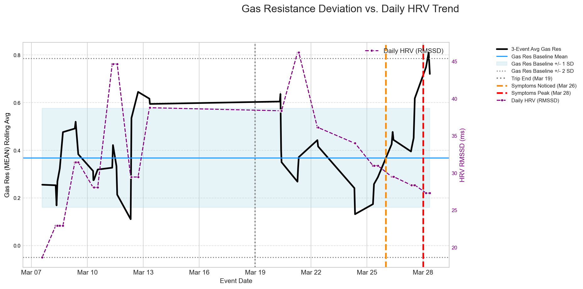
Gas Resistance rolling average (black line) shown against its baseline range (blue bands). Note the sustained deviation above baseline (+1 SD) between Mar 20-25, coinciding with declining daily HRV (purple line, right axis), before symptoms were noticed (orange line).
From Data to Dashboard: The IntelliGut Vision
Raw sensor data is complex. Our goal is to translate it into simple, actionable insights for the user. Based on this analysis, we conceptualized improvements to our app dashboard:

Intelligut mobile app dashboard
1. Daily Gut Check — A Simple Score, Backed by Smart Analysis
Every day, IntelliGut gives you a Gut Check score between 0 and 10.
This number represents your current flare-up risk — based on subtle shifts in gas patterns, symptom logs, and physiological signals.
0–3 (Green): Stable. Your gut is behaving like it normally does.
4–6 (Yellow): Mild instability. Your gut may be shifting — time to stay aware.
7–10 (Red): High likelihood of flare-up. Patterns resemble past pre-flare events.
We don’t diagnose. We highlight patterns. This score is based on your personal baseline, not someone else’s average.
2. Flare-Up Risk Trend — What’s Changing and When
The trend graph shows how your gut risk score has moved over time.
Why is that important?
Because many people experience gut flares after multiple days of instability, not instantly.
The shaded area shows your personal baseline window.
The orange/orange-red zone shows a rising risk trend.
You can visually correlate this with meals, stress, sleep, or symptoms you’ve logged.
3. Insight Cards — Personalized Pattern Recognition
This section shows automatically generated insights, based on AI analysis of your recent data.
“Your gut activity pattern has shifted compared to baseline. Similar changes were seen 2–3 days before your last symptom episode.”
These aren’t generic alerts. They’re personalized, based on what happened in your history. It’s like having a data scientist watching your gut trends for you.
4. Timeline + Tags — Zoom In, Zoom Out
With tools like “Timeline,” “Pattern,” and “Trends Explained,” you can:
See what led up to previous flare-ups
Track how symptoms follow specific triggers (e.g., stress, meals, sleep disruption)
Identify lag time between changes in gut gases and symptom onset
Why This Matters
We believe the best gut health tool is one that helps you connect the dots, not overwhelm you with raw numbers.
The IntelliGut dashboard is built to make gut science visible, actionable, and human-friendly — even when the data comes from something as complex as your microbiome.
What This Means for IntelliGut (and You)
This intensive N=1 analysis, while preliminary, provides powerful validation:
It IS Possible: Passively monitoring toilet sensors can detect meaningful physiological changes related to diet, lifestyle, and health events.
Personalization is Paramount: Tracking deviations from an individual's own baseline appears crucial. What's normal for one person isn't for another.
Context is King: Integrating sensor data with logged information (diet, symptoms) and wearables (HRV, sleep) is essential to move from observing changes to understanding them.
Early Indication Potential: The gas resistance trend preceding symptoms offers tangible hope for developing proactive health management tools, though much more data is needed for validation.
The Path Forward
This is just the beginning. To build the robust, AI-powered guidance system we envision, we need to move beyond N=1. Our next steps involve:
Collecting longitudinal data from more users to understand inter-individual differences and establish stronger baselines.
Fully integrating and analyzing logged data (diet, symptoms) and wearable data (HRV, sleep, activity) alongside sensor readings.
Developing and validating more sophisticated algorithms and machine learning models for personalized scoring and potential prediction.
We're incredibly excited by these initial results. They demonstrate the tangible potential of IntelliGut to provide unprecedented insights into gut health, moving towards a future of truly personalized and proactive wellness management.
Want to be part of the journey?